Can Fujifilm Learn from Sony?
by Joel Wolfson
In spite of my great fondness of my Fujifilm cameras, I have some constructive criticism. My biggest pet peeve with Fuji is their frustrating lack of consistency among bodies. It drives me a little nuts when switching between my Fujifilm bodies that are different models. As Fuji brings out new models, they move the button placements, not to mention size and feel of the controls or even omitting controls on some bodies and not others. I can’t think of any two models that have the same layout other than the X-Pro3 and X100V though that isn’t a totally fair comparison considering the X100V is specialized and doesn’t have interchangeable lenses.
Having owned Sony systems alongside Fujifilm allows me a comparison with another innovative camera manufacturer. I believe Sony’s common body form and consistent physical interface helps contribute to customer happiness and retention. One can buy additional bodies that are different models or upgrade an individual body and still operate them quite naturally.
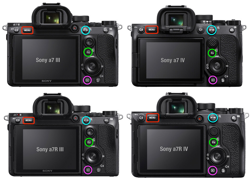
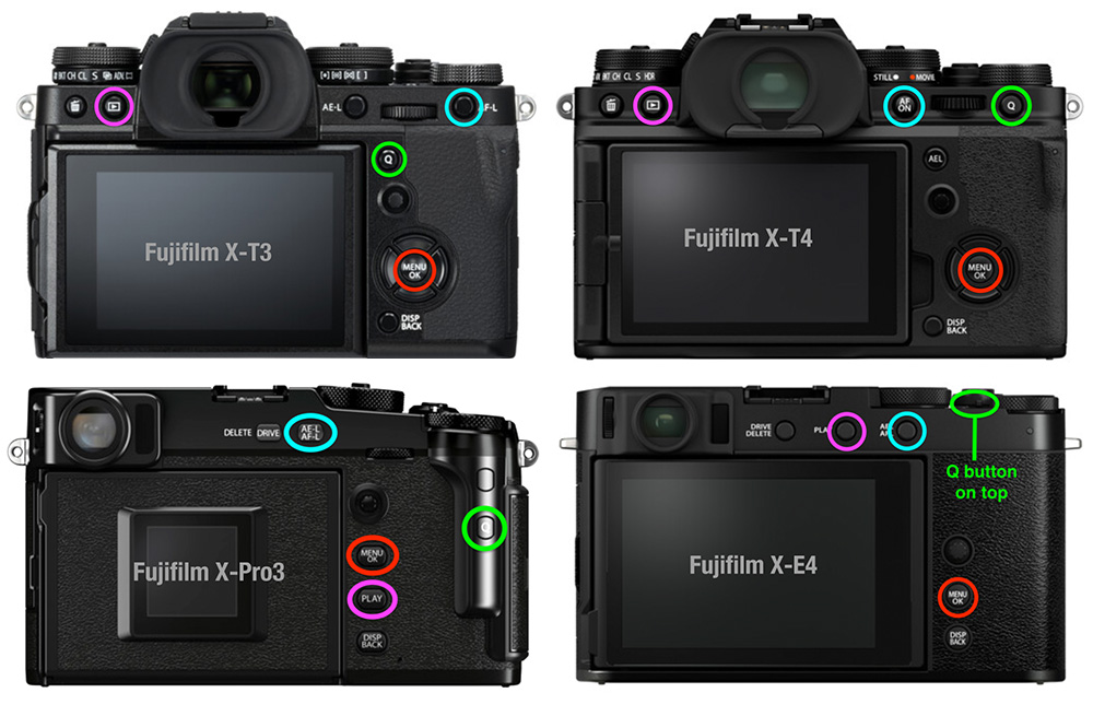
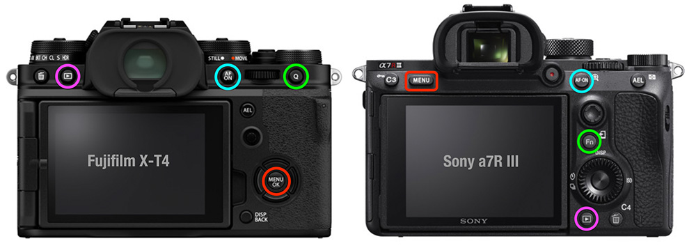
See below where I’ve highlighted some frequently used controls on various Sony and Fujifilm bodies. Look at the difference in consistency between the two brands. I color coded the equivalent controls the same way for easy comparison (AF buttons in light blue, Menu buttons in red, Fn/Q menu buttons in green, and playback buttons in magenta.) I chose these controls because other than being able to program the AF button, the other 3 are not changeable in their function, yet I use them frequently. I realize every photographer has different favorite controls but these are a good illustration of the concept.
Sony’s controls on different models and generations

Fujifilm’s controls on different models and generations

My real world experience
I currently own 3 Fujifilm bodies. I have two X-T3s and one X-E4. I actually got rid of an X-T4 body in favor of having two identical (X-T3) bodies because of the differences when switching quickly between bodies. One of my X-T3s is dedicated to infrared (IR). I generally take both IR and visible light bodies with me so I switch back and forth often. Because my X-E4 is so different from the X-T3s I find it a little easier to be conscientious of having to think about the differences than I did going between an X-T3 and X-T4.
Sometimes I want a lighter kit or to have two visible light bodies and I bring my X-E4 body so I end up switching between two different models. Even though I know them all well I feel I lose shots sometimes when shooting quickly, such as sports or wildlife, because of having to pause and think about where the controls are that I need. I sort of understand Fuji omitting some controls to keep the X-E4 compact but even if one were to use it as a companion body to the similarly styled X-Pro3, several key controls are still in different places. This is rarely an issue when switching quickly between Sony bodies that are different models. In my case I have regularly used an a7R III and a7 II side by side, with no problems.
Unfortunately Fujifilm seems to look at each model in isolation and and only thinks about “improvement” just within that one model with little concern for consistency. In addition to photographers simply upgrading a single camera, there are also many enthusiasts and pros that want to have two or more bodies.
If you are using Sony you can own any number of different models and comfortably switch among them. But if you own two or more different models of Fujifilm bodies, you will have to consciously think about which one you are using and where that Q button or AF button or Play button, etc. resides, each time you switch. Of course if you use them a lot you can train your brain to some extent but in the end you will likely miss more shots with Fuji than Sony due to this frustrating lack of consistency.
Fujifilm really has fantastic gear and I hope they will recognize this area of potential improvement and work on consistent control layout on their cameras moving forward. I believe it would improve both customer happiness and create more Fujifilm loyalists.

Oh brother. I was excited to enter the Fuji world a year ago. First, a new x100v for street use and then an xt4. Unfortunately, i quickly became so annoyed with missing four way button and recessed Q button on x100v. Then, very poor placement of the play button and once again a difficult to find and use Q button on xt4. It’s like, a non photographer making design decisions. Two new top of the line cameras, and neither is consistent with the other and both have a high level of design issues that should have never left the plant. It’s like no field testing by photographers around the world ever happened. These things are kind of embarrassing to exist. But there is enough to like. And yet, i always feel a level of stress using either camera. My Nikon system has never been like this. All these issues can be fixed and consistency restored moving forward. And please, STOP removing controls to achieve some sort of “clean” look. And absolutely STOP recessing buttons for the same idiotic reasoning.
I similarly sold off the X-E3 for an X-T20 to better match the control layout of my X-T3’s in a compact body.
Tho I prefer the form of a pseudo rangefinder (and the joystick) every time I would pick up the X-E3, I’d find myself fumbling or taking the camera from my eye, in trying to deal with the Fn/button placements and the lack of a D-pad.
Your reasoning for selling off your X-T4 was also a major consideration in my decision in not to switching to X-T4 ‘s despite a desire for IBIS.