Psychology of Color in Photography
by Joel Wolfson
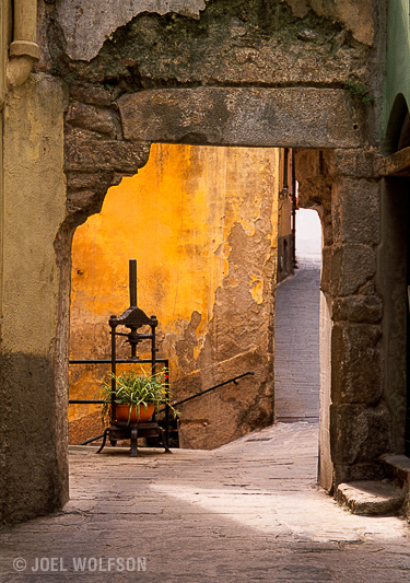
I went through all my best selling fine art images and found that most of them had a predominant presence of yellow in them. Why would that be? Because colors affect us both psychologically and physiologically. Yellow imparts a sense of warmth, cheerfulness and comfort. It is welcoming and stimulates mental activity. So it makes sense that more people would buy the images that impart these attributes and emotions. Color alone may not sell your photographs but colors and their meaning are often overlooked by photographers.
The next time you’re shooting color think about what the colors in the image will impart to the viewer. How colors affect us is an extensive topic and I don’t claim to be a psychology of color expert- but below is a condensed list and guideline you can use as another tool to help you convey what it is you’re trying to get across to the viewer. There are many studies and articles published online if you want to research it more. In the meantime here’s my quick guide for photographers:
Red– action, passion, danger, heat, love. Increases metabolism and respiration rate.
Blue– tranquility, calmness. Decreases metabolism.
Yellow– warmth, comfort, cheerfulness. Stimulates mental activity and is welcoming.
Green– growth, freshness, renewal, harmony. Most restful to the human eye.
Orange– movement, joy, creativity, energy. Increases oxygen supply to the brain.
Purple– power, prestige, creativity, ambition.
I would like to note that psychological aspects of color will vary with different cultures. These differences may be narrowing due to the internet but what I’ve discussed here is based on studies and information gathered in the United States and Canada.

Joel Wolfson is an internationally published photographer. He loves teaching as much as shooting and has pursued both passions since college. He shares his 25+ years of experience as a working pro with photographers of all levels by way of his workshops, 1 on 1 training, webinars, articles, blog and speaking engagements. He has been published internationally and his articles have been translated for use in more than 30 countries. Yet he is best known for his artistic images of nature’s fleeting moments and unexpected views of everyday places around the globe. Joel works with great affiliates like Topaz Labs and Arizona Highways to have more avenues for working with those wanting to pursue their love of photography. His goal is to make learning and improving one’s photography easy, fun and rewarding.
Leave a Reply